MasterPlan Outdoor Living
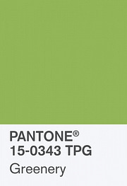 Pantone’s 2017 color of the year has been named, Greenery! When we heard the color of the coming year was a glorious shade of yellow-green, we were elated. This is the color that most represents MasterPLAN Landscape Design, not only as a brand, but what could be considered a representation of the color of life. This brings up the question, what does this color mean to Pantone?
Pantone, aptly naming itself the “global color authority”, has been naming the color of the year since the start of the millennium. After the reveal of next year’s shade, it made us wonder why. Do they pick colors out of a hat? Does Pantone have an official panel that cast a secret ballot in a dark basement somewhere? Maybe there is a real reason behind their choices.
In researching the thought process behind Greenery, it started to resonate that the annual choice goes way beyond an aesthetic color to shake up the new year, the colors are representing the mood, feeling, or shift of conventional society. Take for example, the 2015 color of the year was Marsala, which is comparable to the deep earthy shade of a fine wine, which was said to be chosen to represent the political arena at the time, which was indicative of security and well-being. 2016 brought the world 2 Pantone choices, Serenity and Rose Quartz (basically baby blue and baby pink), for which it represented societal gender equality. So, if Pantone correlates social meaning to color, what does Greenery stand for?
Leatrice Eiseman, Executive Director of the Pantone Color Institute, explains, “Greenery bursts forth in 2017 to provide us with the reassurance we yearn for amid a tumultuous social and political environment. Satisfying our growing desire to rejuvenate and revitalize, Greenery symbolizes the reconnection we seek with nature, one another and a larger purpose”.
While the Institute’s justification behind the 2017 choice has its implications of the governmental shift in our currently stressful and tense world, we at MasterPLAN can tell you what Greenery means to us. Life.
We agree with the aforementioned Executive Director, this shade of yellow-green symbolizes nature and new beginnings; you may also add the words refreshing, rejuvenating, renewal, rebirth, purity, simplicity…and the list continues. When the cold and blustery winter weather fades away and spring has sprung, the early green blooms start to appear, signaling new life, energy and progress. If color could be a feeling or movement, this shade of green would certainly be that of energy and action.
So while some may see this color, as simply…just a color, others may read between the lines of turmoil and prosperity, MasterPLAN chooses to view this color as an inviting color of emotion, a little bit of relaxation mixed with a dollop of vibrancy and vitality, all pointing in the direction of recharge and contentment.
We will leave you to your own interpretation of the 2017 Pantone color of the year, but one thing is for certain, you will never be able to escape this color in the wonder that is nature!
- Using timeless design, cutting-edge materials and keeping a keen eye on the details, MasterPLAN Landscape Design would love to chat about the full potential for your property! Serving the Poconos, the Lehigh Valley and through the Main Line of Philadelphia, we are ready to show you how we can make your dream backyard become a reality. When you are ready to reach out to MasterPLAN, we are ready to chat!
Join Our Newsletter
Stay up to date with what is happening with MasterPLAN Outdoor Living.
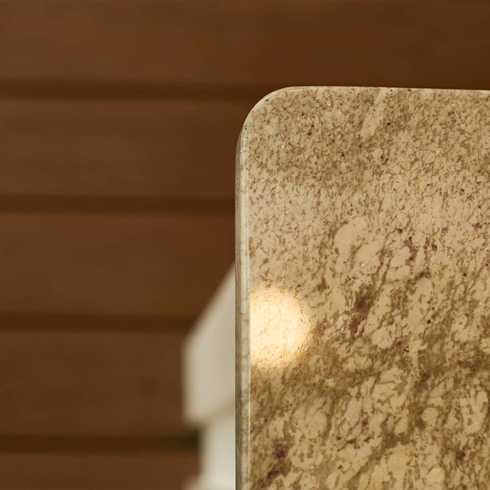
It is our pleasure to pay attention to every little detail of your project. For example, we design our granite countertops with eased edges and rounded corners for an added safety measure!
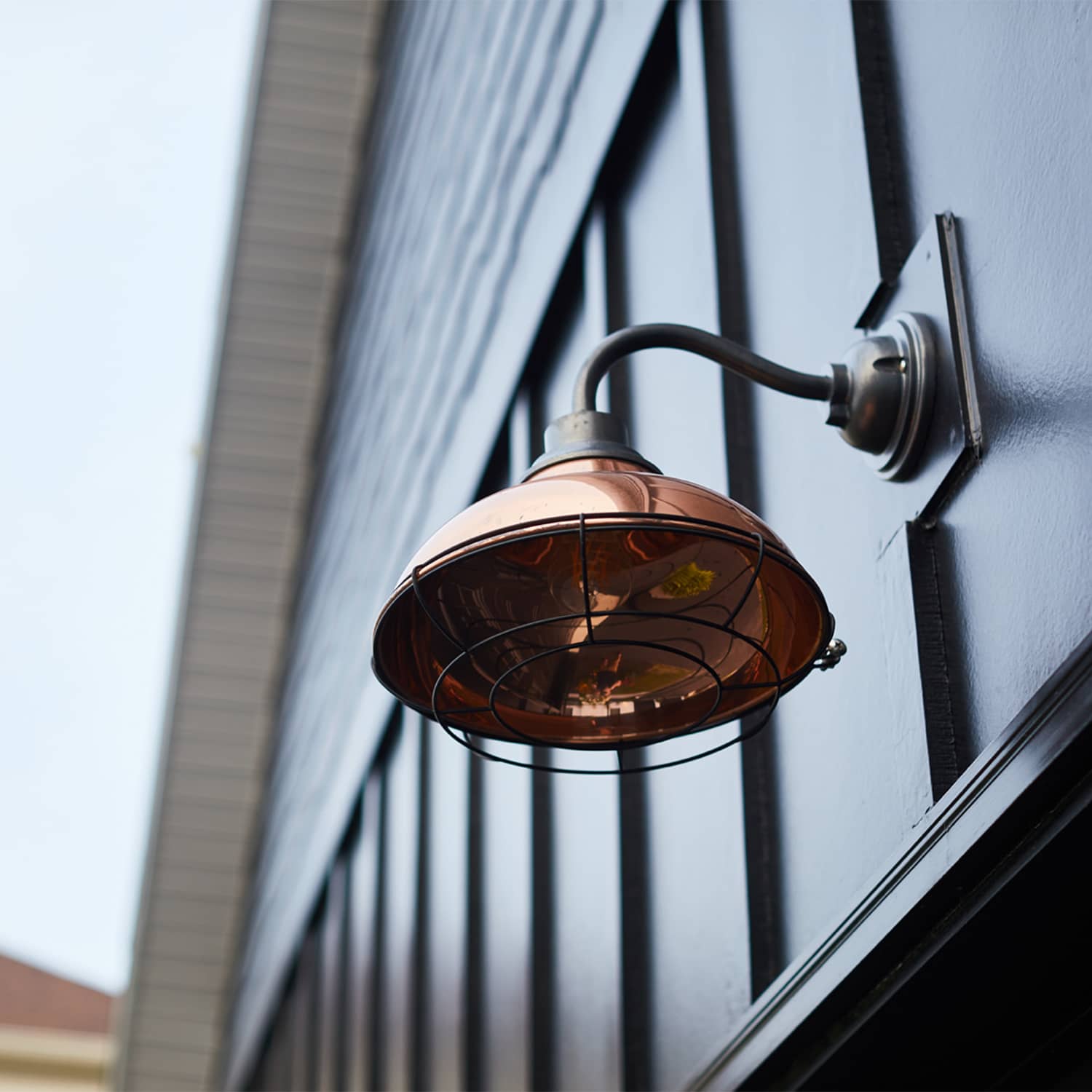
Details. Details. Details!
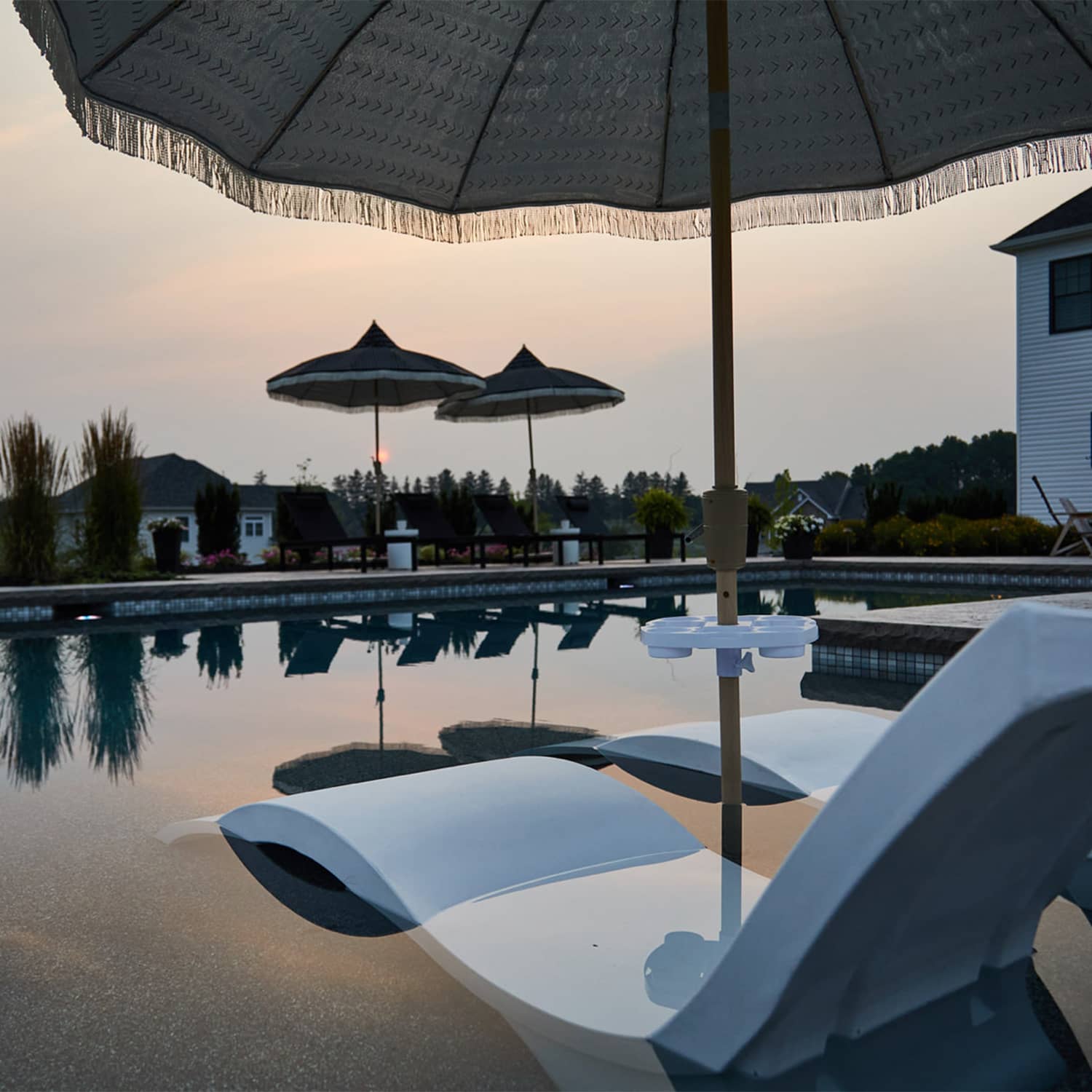
Your favorite vacation spot, right outside your door is truly possible with MasterPLAN!
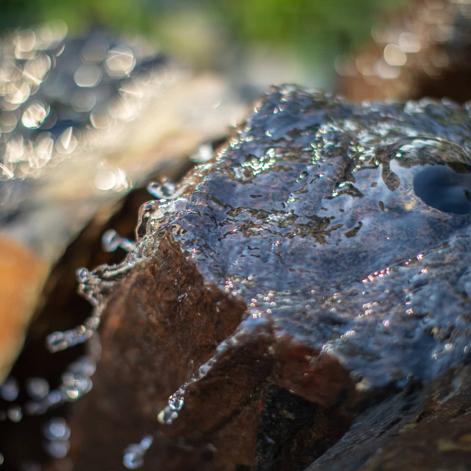
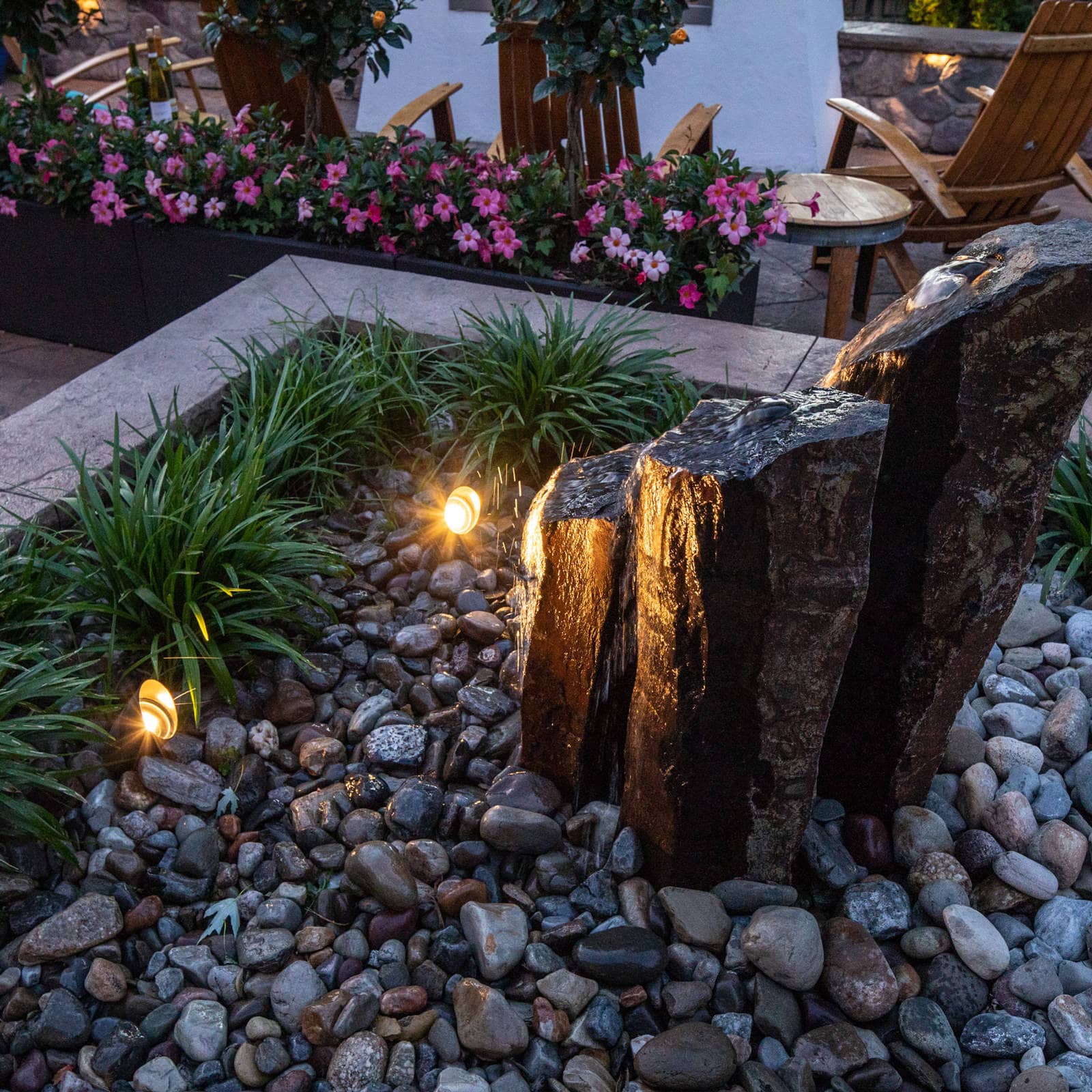
Beautiful within the landscape and soothing to the soul, natural basalt stone spires make the perfect water feature to accent any outdoor living space!
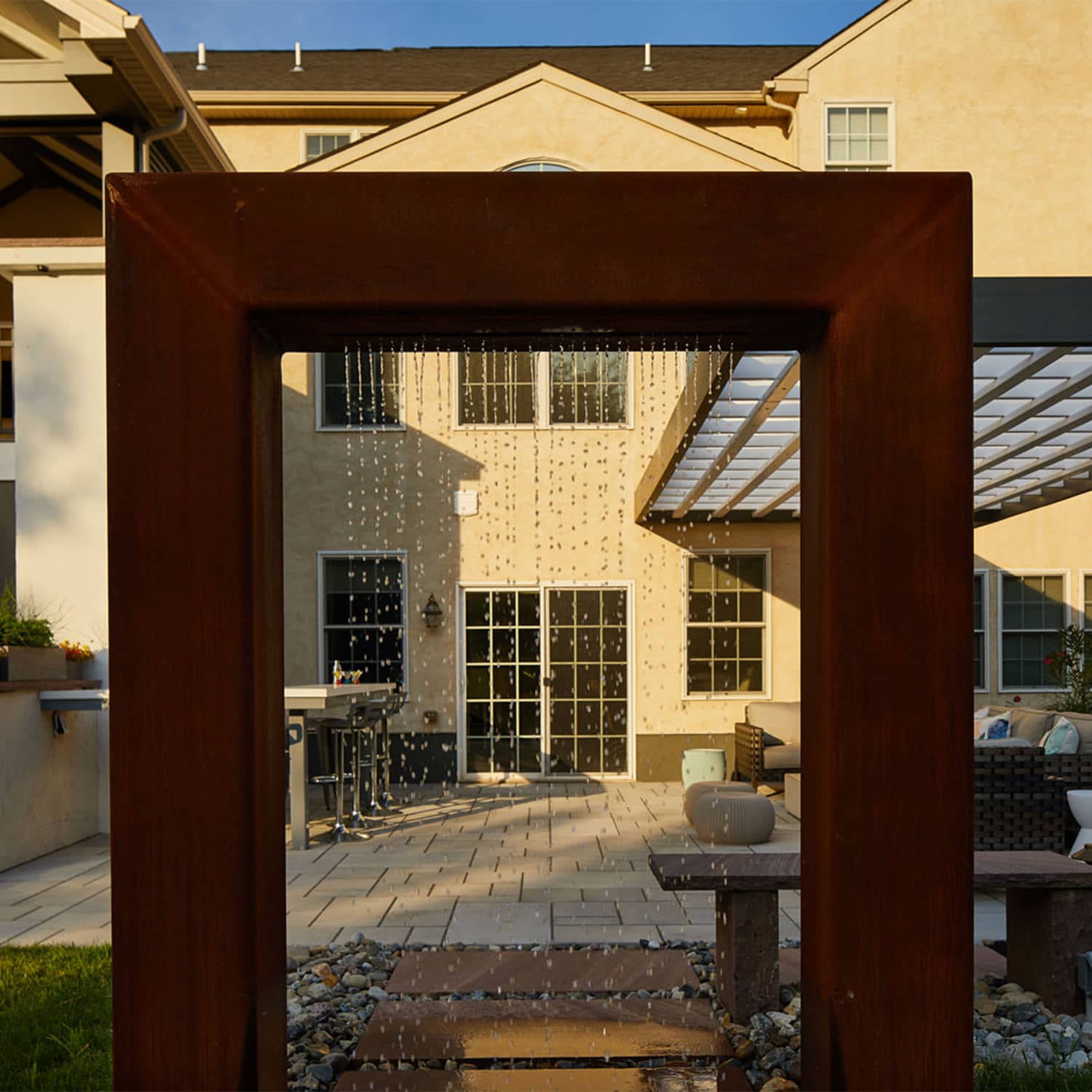
Perfect placement is everything, especially when it comes to focal points when viewed from inside the home!
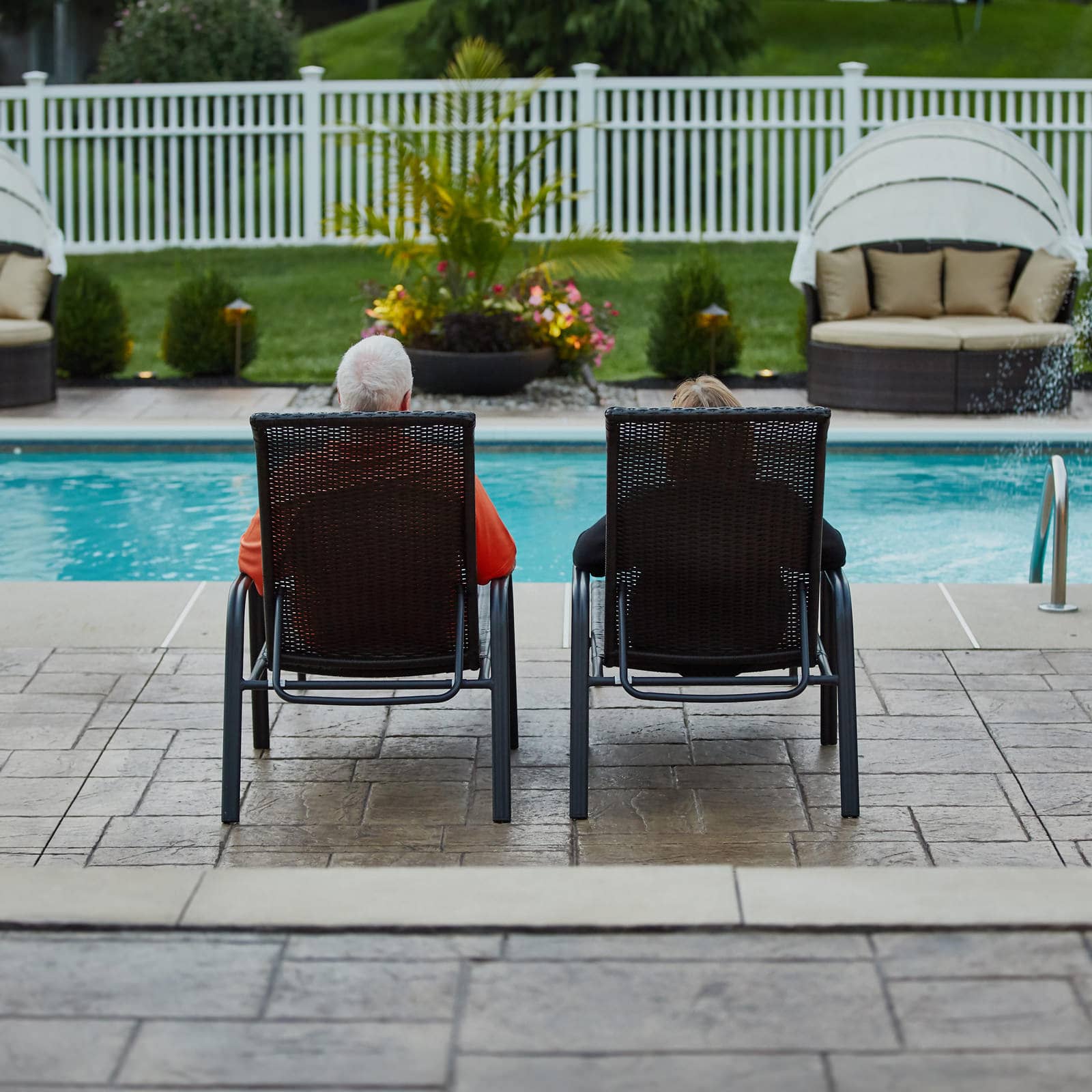
This lovely couple from Bethlehem feel like they are on vacation everyday in their own MasterPLAN created backyard!
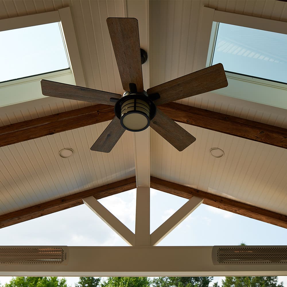
A beautiful balance between the barnwood clad beams and ceiling fan against the crisp, clean, white Azek and tongue & groove ceiling provide a modern rustic feel to this outdoor living space.